To grant access to this report, go to Loyalty > Settings > System > Loyalty Permissions and mark the checkbox next to Loyalty BI for the relevant profile
-
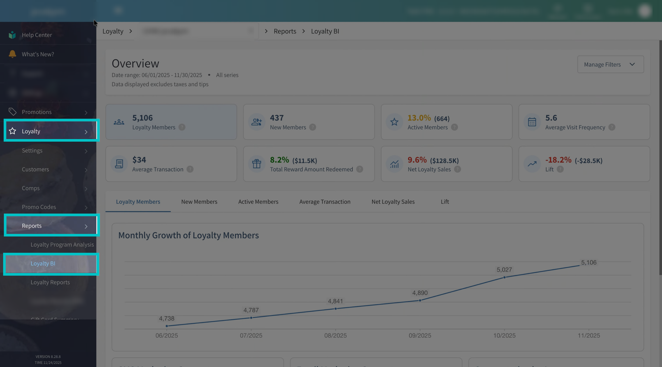
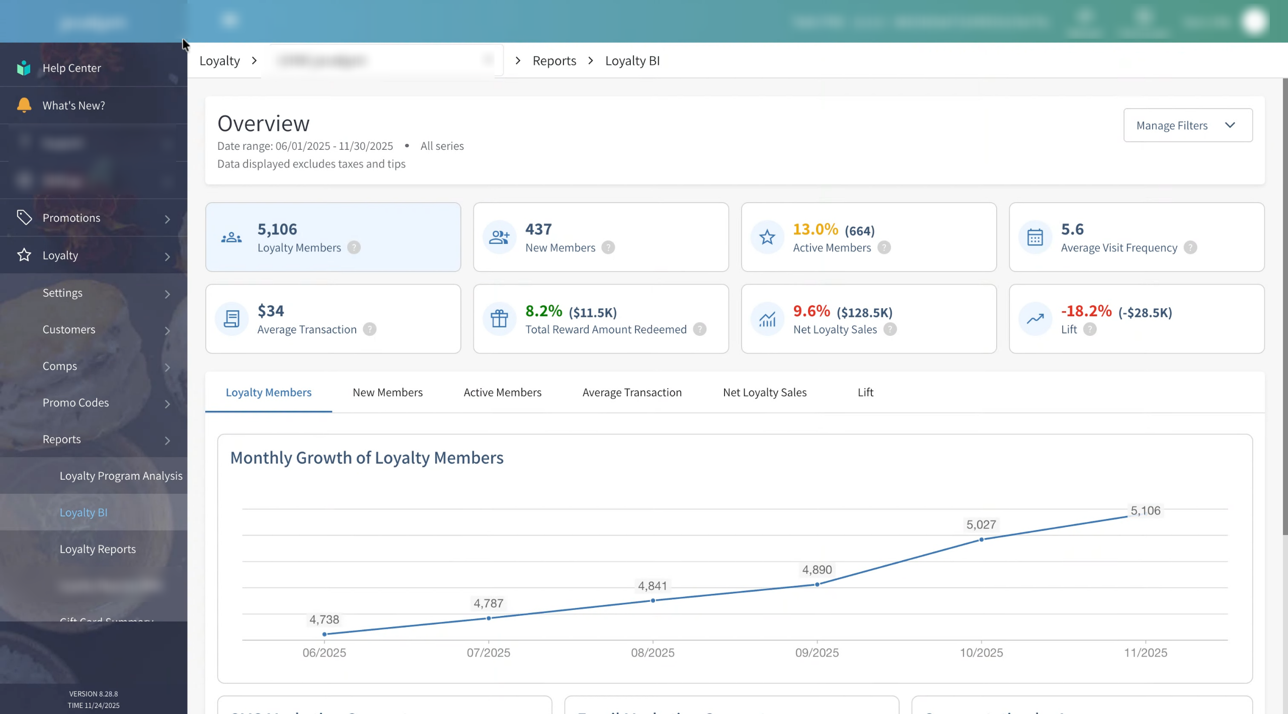
In Tabit Office, go to Loyalty > Reports > Loyalty BI. Viewing this report is permission-based, so only users with the correct permissions will be able to access it
-
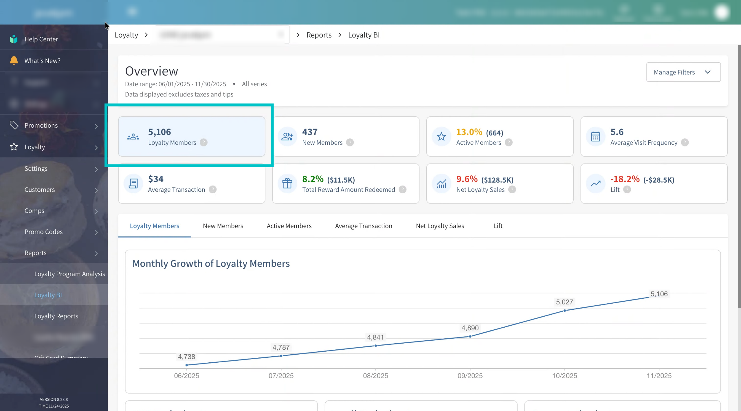
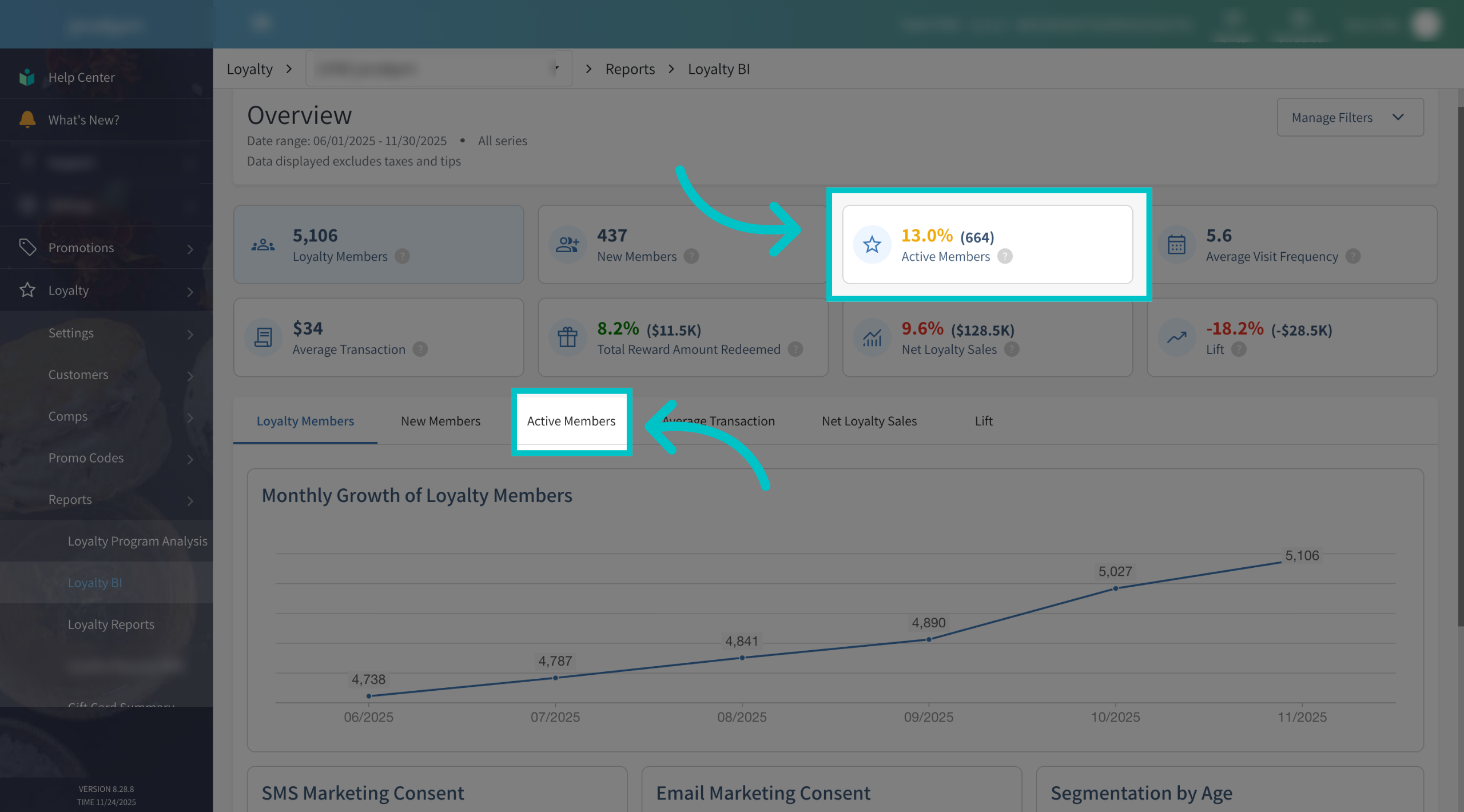
The Loyalty BI overview shows the general health of your loyalty program at a glance. You’ll notice that some metrics are highlighted in different colors:
- Green – Performing well / on or above target
- Yellow – Needs attention or is in a “warning” zone
- Red – Underperforming and likely needs action
Each metric has its own thresholds for these colors, which we’ll review below. Let’s start by looking at the top part of the screen
-
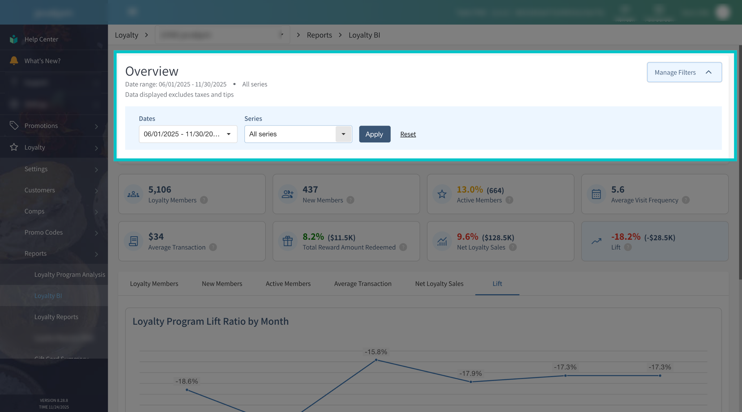
If needed, you can filter the BI view by date range and by series using the controls at the top of the page. This is helpful when you want to focus on a specific campaign period or see how a particular series is performing
-
On the left side, you’ll see the total number of Loyalty members currently in your program. This is the size of your loyalty base and is a good starting point for understanding reach and growth over time
-
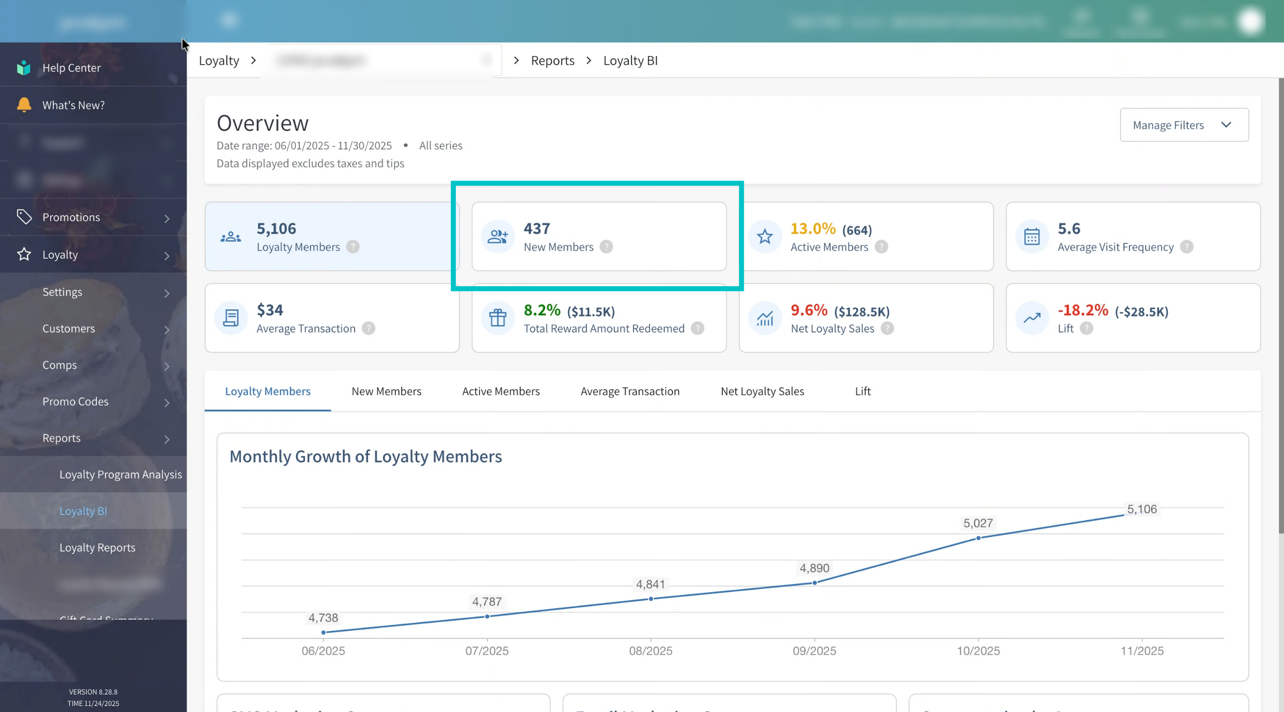
New members shows how many guests joined your loyalty program in the selected time period. Use this to track acquisition and understand if your sign-up campaigns are working
-
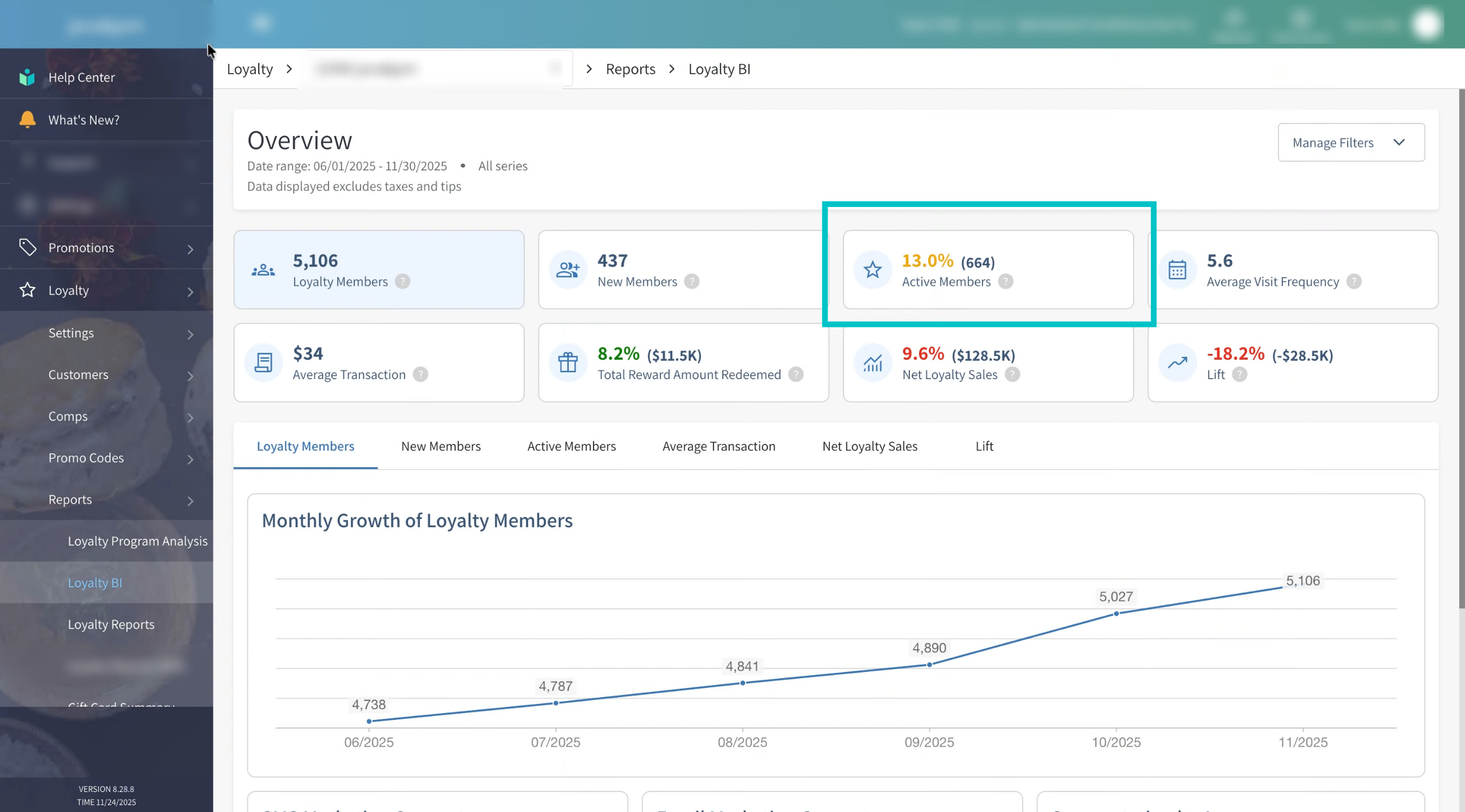
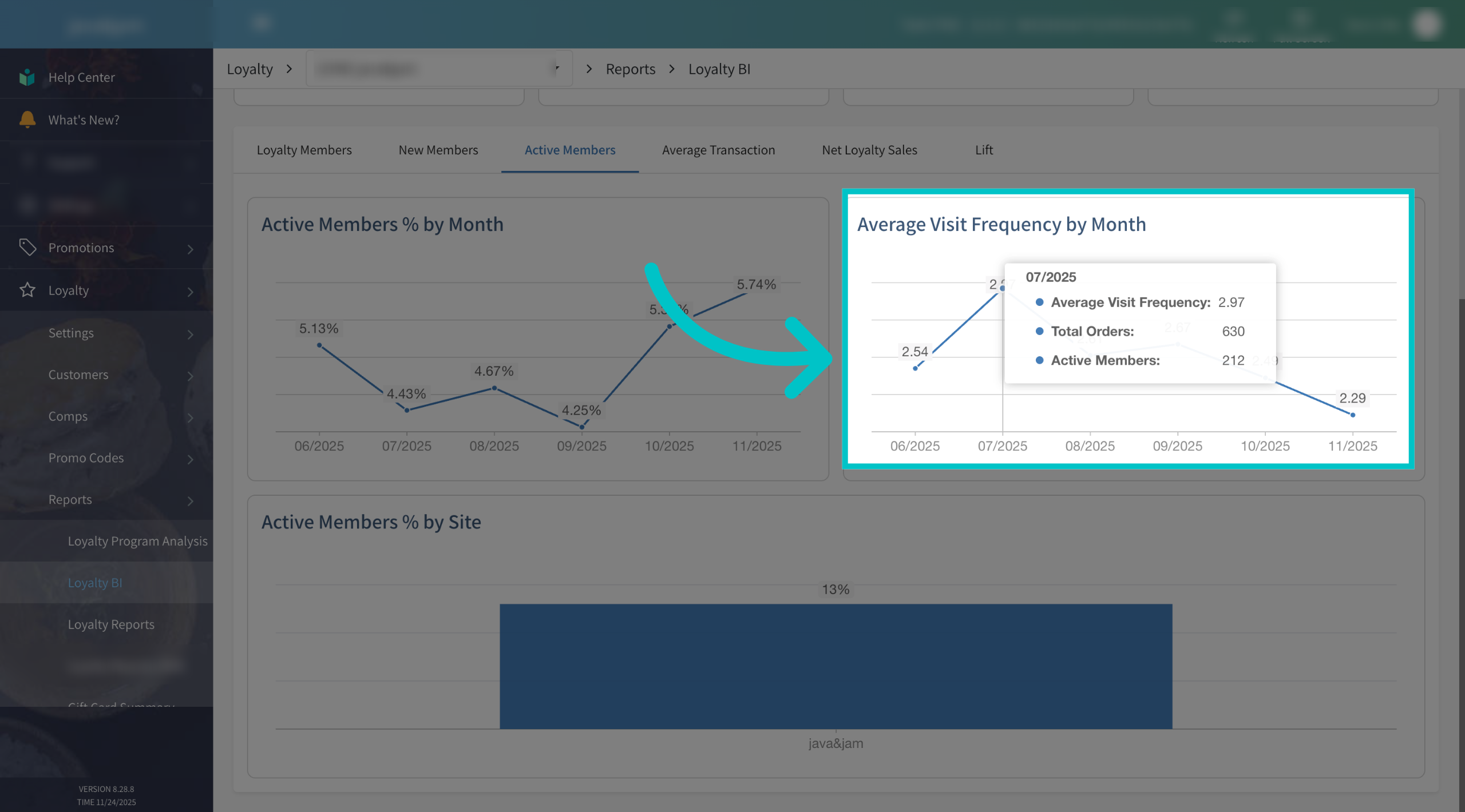
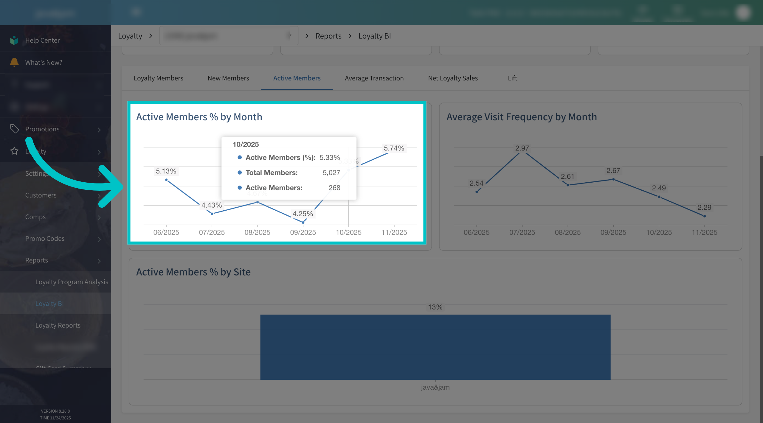
Active members shows how many loyalty members completed at least one transaction during the selected time period. The percentage indicates what portion of your total members were active. Color thresholds for this metric are:
- Green – 41% or more of loyalty members were active.
- Yellow – 11% to 40% of loyalty members were active.
- Red – 0% to 10% of loyalty members were active.
This is a key indicator of how engaged your loyalty base really is
-
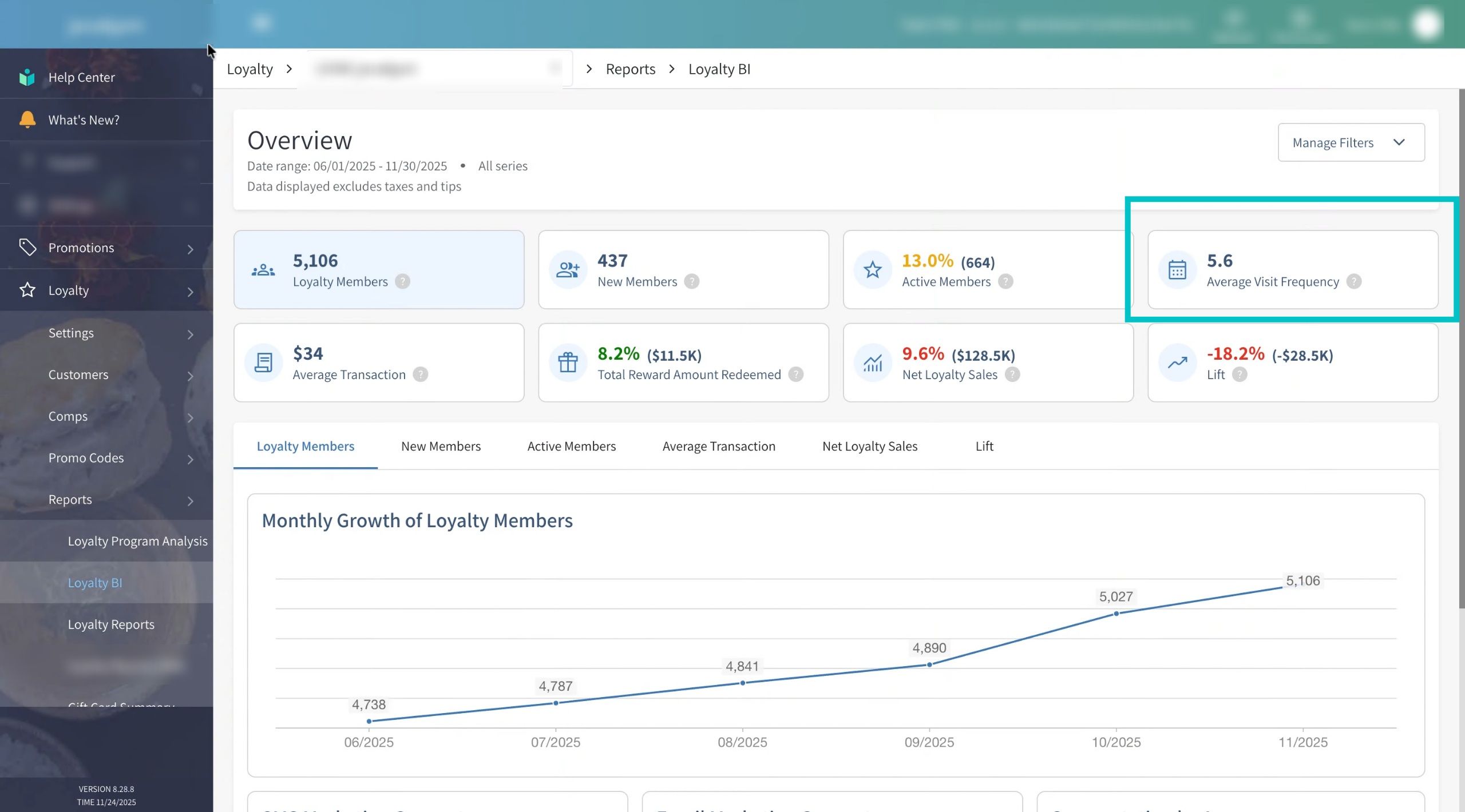
Average visit frequency shows how often your loyalty members visit your restaurant during the selected period. Members who have never completed a transaction are not included here, so this metric focuses only on actual, visiting guests
-
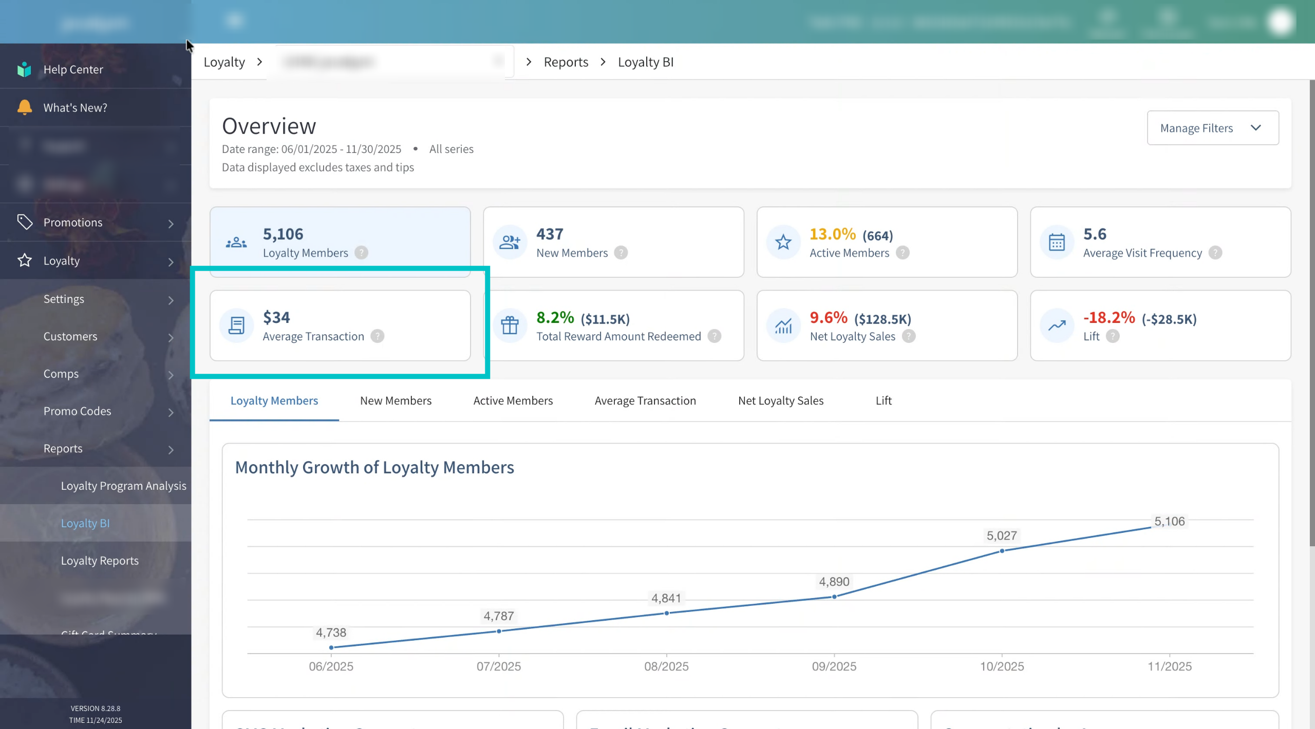
Average transaction shows the average transaction amount for all loyalty members during the selected period, after applying any rewards. This helps you understand how much loyalty guests typically spend per visit
-
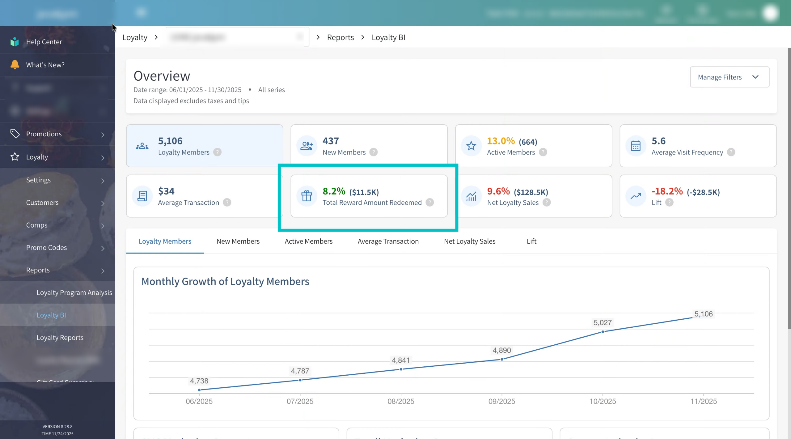
Total reward amount redeemed shows the total monetary value of rewards redeemed by loyalty members in the selected period. The percentage indicates what portion of your total sales for that period came from reward redemptions. Color thresholds for this metric are:
- Green – 41% or more of total sales value is linked to reward redemptions
- Yellow – 11% to 40% of total sales value is linked to reward redemptions
- Red – 4% to 10% of total sales value is linked to reward redemptions
This helps you understand how heavily guests are using the rewards you offer
-
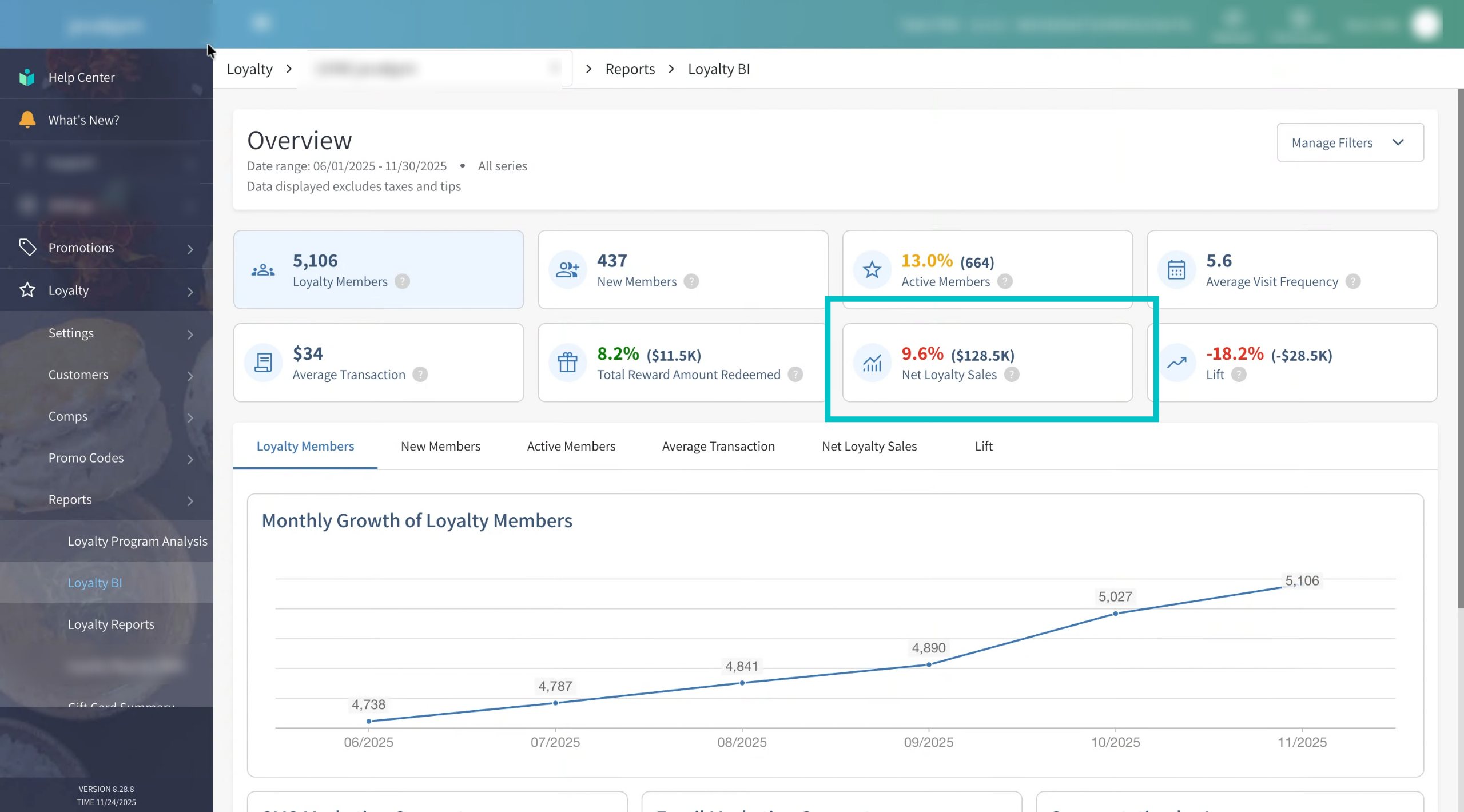
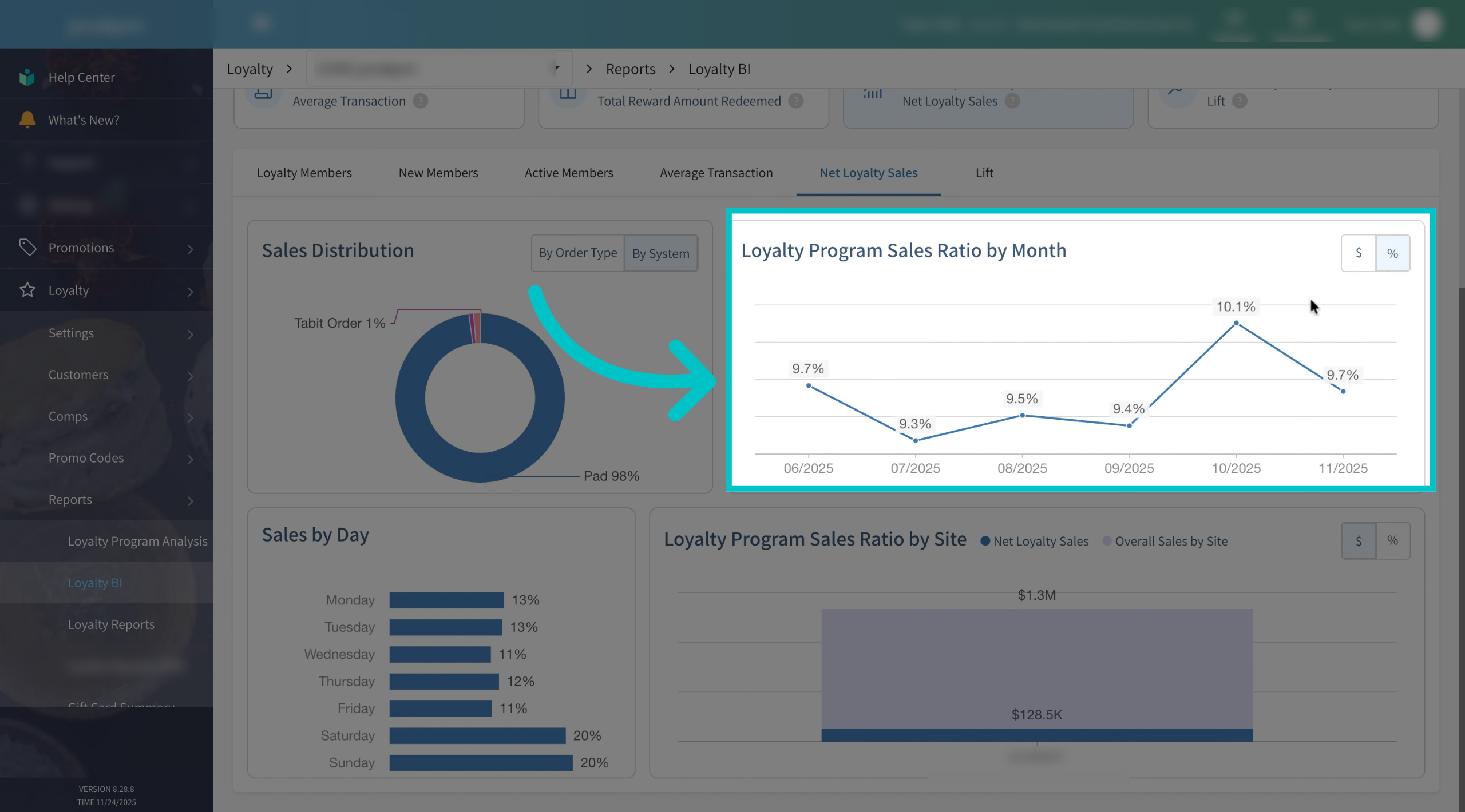
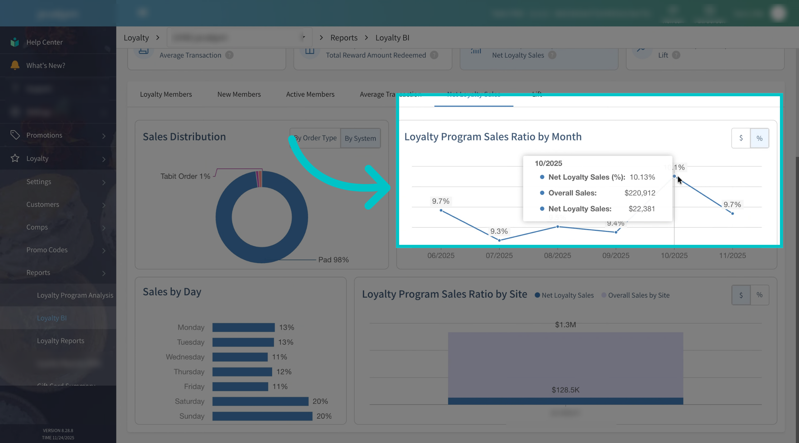
Net loyalty sales shows the total value of transactions during the selected period where loyalty members identified themselves, after rewards have been applied. The percentage shows how much of your overall sales came from loyalty members. Color thresholds for this metric are:
- Green – 25% or more of total sales are from loyalty members
- Yellow – 10% to 25% of total sales are from loyalty members
- Red – 0% to 10% of total sales are from loyalty members
This tells you how much your loyalty program is contributing to your revenue mix
-
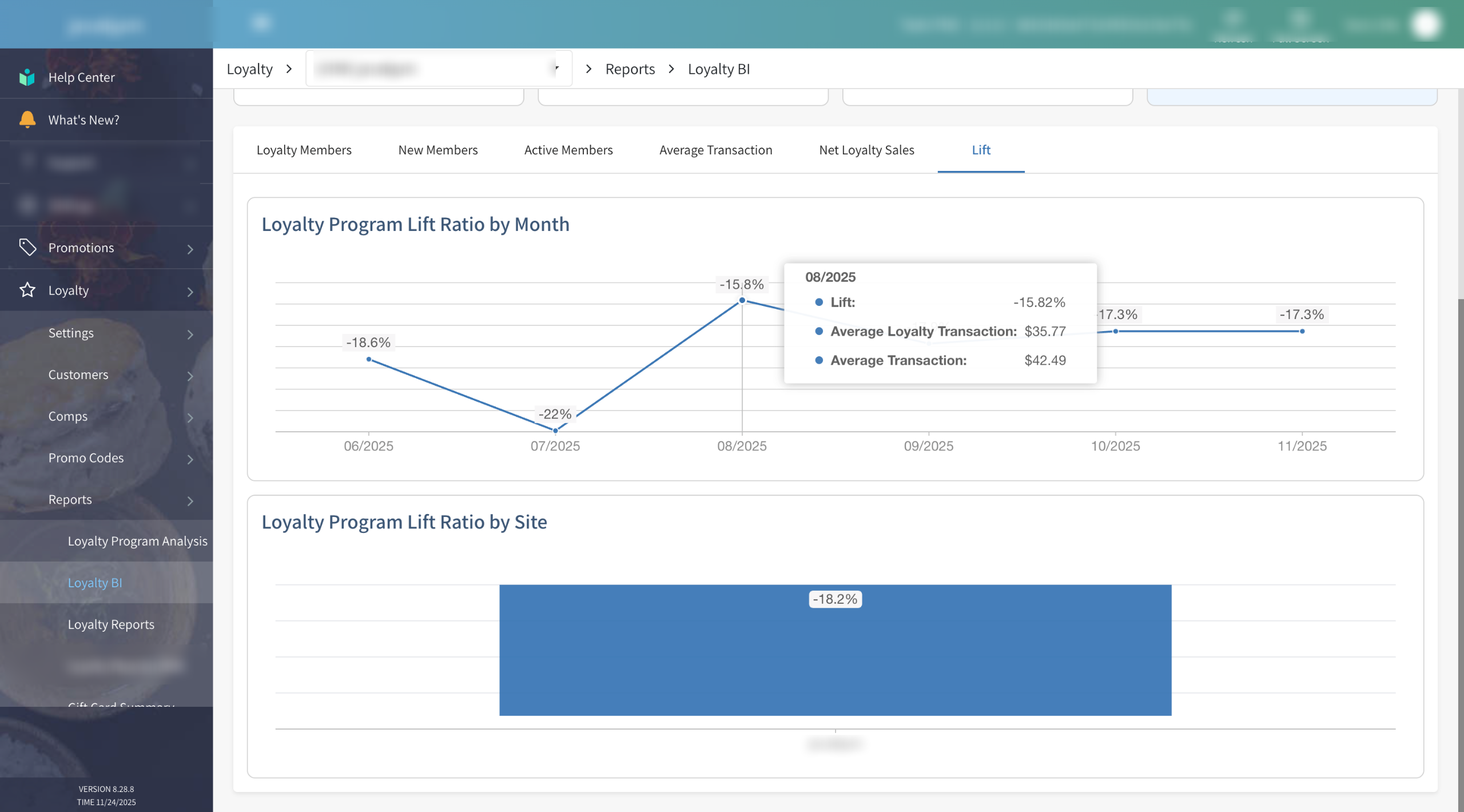
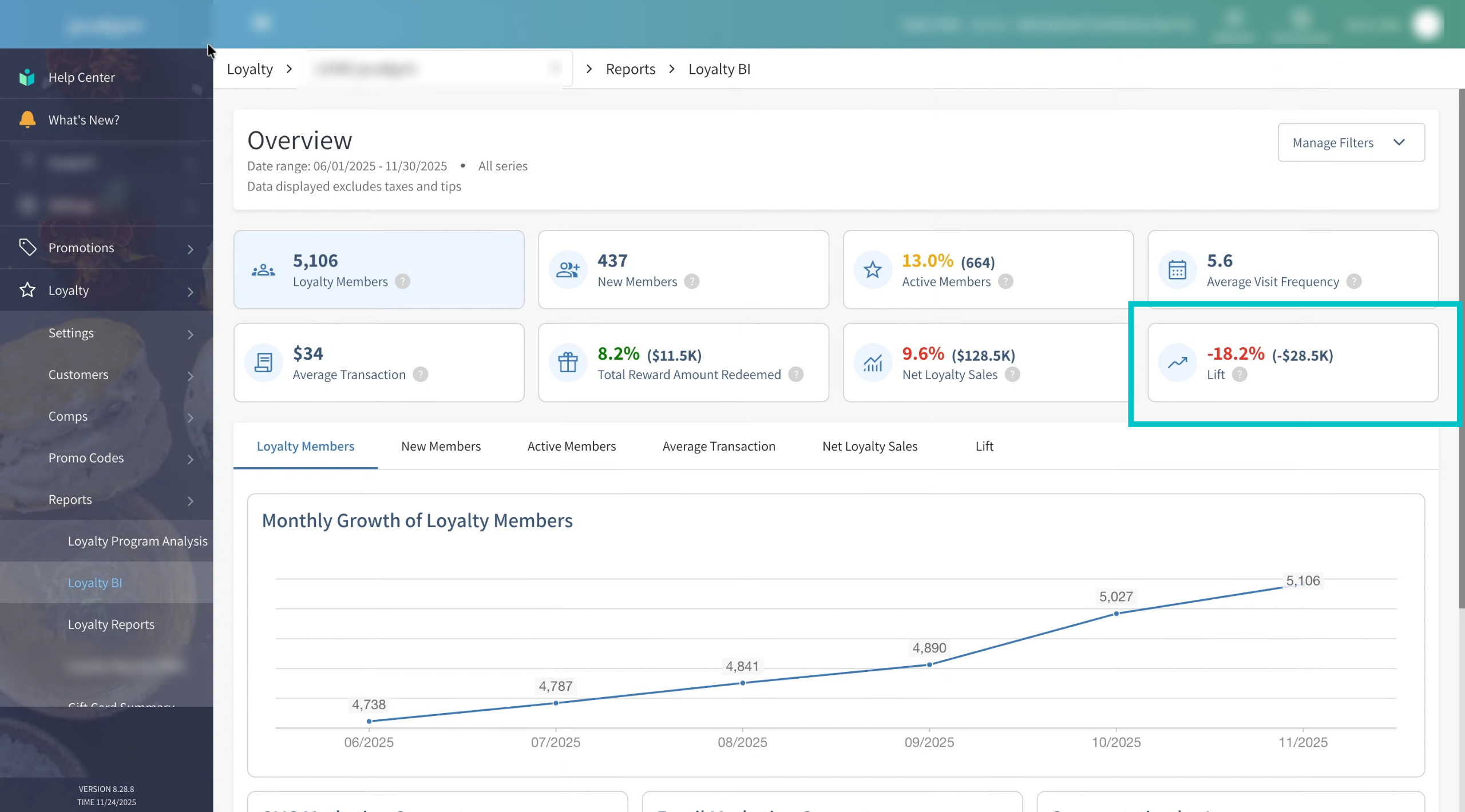
Lift shows the percentage increase in transaction value or frequency for loyalty members compared to non-members. A higher lift means your loyalty program is successfully encouraging guests to spend more or visit more often. Color behavior for Lift is:
- Green – Positive lift (loyalty members outperform non-members)
- Red – Negative lift (loyalty members underperform compared to non-members). If it is red it indicates that you should take immediate action to stabilize your loyalty program
This is one of the most powerful indicators of how effective your loyalty program really is
-
You can drill down into specific segments for more detailed insights. Select the button at the top or click the relevant tab (such as New members) to explore that segment in depth.
-
Hovering over any point on the graphs will show additional details. For example, a graph might show average visit frequency per month, and hovering over a point can also reveal:
- Total orders in that month.
- Total active members in that month.
Together, these numbers help explain how the percentage or value shown on the graph was calculated.
-
Here’s another example of how hovering over a data point reveals more context. Use this to understand spikes, drops, or trends in your metrics instead of just relying on the main line or bar.
-
Some metrics can be viewed by monetary value, as shown here. This is useful when you want to focus on the currency impact rather than percentages or counts.
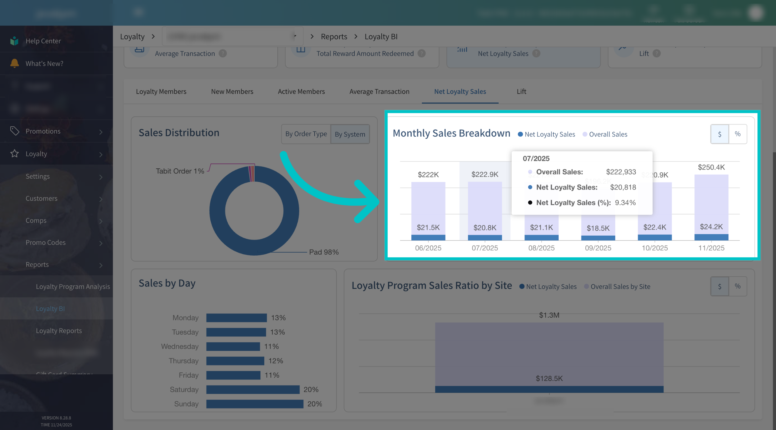
-
You can also switch to viewing the same metric by percent using the toggle at the top-right of the graph. This makes it easier to compare performance across periods of different sizes or sales volumes.
-
Even in percentage view, you can still hover over the chart to see exact values and supporting details. This combination of visual trends and precise numbers makes it easier to understand changes over time and explain them to your team.
-
Take some time to explore what Tabit Loyalty BI has to offer — click through the tabs, hover over charts, and compare values and percentages. The more you interact with these dashboards, the easier it becomes to spot trends, find opportunities, and make smarter decisions for your loyalty program and your business overall.